

From Punched Cards to Prompts
AndroidIntroduction When computer programming was young, code was punched into cards. That is, holes were punched into a piece of cardboard in a format...
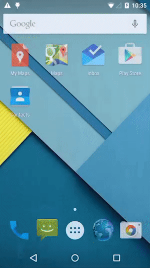
Lollipop, as we’ve mentioned before, is the largest update to Android in years. Material, Google’s new design language, is at the forefront of those changes.
Material, the huge undertaking aimed at giving Android a subtle new look, takes its inspiration from physical materials and makes them digital. New gestures, animations, lighting and colors lend affordances and style in ways that the OS previously did not. The new design language focuses on thin (1dp) “materials” that can play off of each other in flat space (for example, waves of light, called ripples), but don’t bend or fold in 3D.
Elevation is the crux of this paradigm. Elements are said to have a resting elevation they should return to when not in focus or use. Elevation changes can be magnified or reduced to match the depth of the interface (e.g., on a TV vs. a phone). Relationships between objects and the shadows that represent their elevation have also been carefully considered. Animation principles promote easing for lifelike feel. Responsive interactions take the place of skeuomorphic aesthetics.
This clarity makes an “authentically” digital language possible. Google should be lauded for its attention to the design docs; they’ve been out only a few months and already there’s an update.
None of this is terribly hard for UI designers to learn or utilize, but it does put heavier emphasis on interaction design. That means considering how UI elements animate in physical space, how screens transition, and how an interface can become a subconscious conversation with a user. If you’ve been putting off getting strong interaction design into your apps, now is the time. Users will expect more.
Material shifts the paradigm for developers, too. They are being pushed to improve their implementation of these ideas. We know it will be the center of many conversations going forward, especially as we learn the language of Google’s physical-inspired, digital-focused animation style versus iOS’s, which is less digital and more physical.
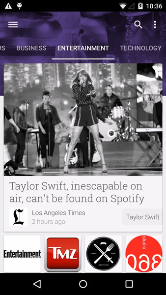
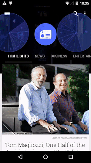
Instead of rehashing Google’s excellent app checklist, I thought it more pertinent to have a look at those standards in practice through Google’s Newsstand app.
Immediately upon entering Newsstand, you are greeted with hallmarks of Material. The ripple effect plays across the full-bleed hero image and cards slide in from the bottom like pieces of paper on a smooth surface. The timing is clean and draws the eye to important pieces of hierarchy.
The use of bold color across the app is both consistent and helpful. It makes wayfinding and returning to the app simple to learn and remember. Newsstand keeps the branding of article sources to an acceptable minimum. Read articles turn black and white.
While I was initially confused about how to interact with the cards as they appear in articles, it quickly became apparent. Layering makes this possible, if a little strange in this case (perhaps it’s because I’m an iOS user most of the time, or that the article was rather short). Cards drive thinking about content in smaller bites. While the Android docs warn against getting too “cardy,” they do make many kinds of interactions possible (sliding in or out of view for example, as opposed to appearing or transforming in place). These, along with the focus on subtle interactions, help push Material in the direction of a natural user interface.
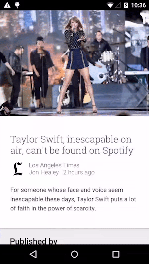
Newsstand is a clear example of Material’s full-bleed hero images. It’s a scheme inspired originally by print and owned more recently by sites like Medium. This app adds the twist of ever-moving headers, which, when paired with the dense color filters, gives it a nightly news feel.
It also adds to a feeling that pervades Material-designed apps: namely, that everything is always on the verge of springing. It’s a bit like a children’s TV show. Color! Flash! Attention! If Material were any more expressive, it would become tiring. Thankfully, the motion is suitably subtle, and it adds more character than bang.
Google apparently didn’t get mired in the debate about whether to hamburger. This drawer was a bit hard to call up, but did cross over the current content, a scheme we’ve seen more of since the aforementioned debate.
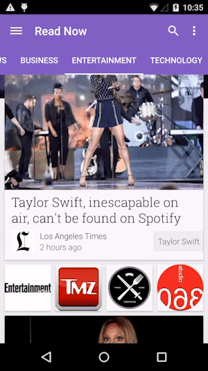
Want another case study? Brian Lovin did a breakdown of Inbox, Google’s new email client, albeit on an iPhone.
Google has made it easy to design for Android 5.0. Not only have they supplied design files for their UI elements (see the resources section), but they’ve made Polymer match Material. If you’re into prototyping and have a few web chops, this is great news. You can quickly prototype ideas for proper user testing using web components. While our frontend web team agrees that these aren’t ready for production web work, they’re a great tool in the box for us designers. Or you could bootstrap it, if that’s your thing.
New releases of Android typically stand in the long shadow of previous versions. This time, Google has done a good job of backwards compatibility. Android’s support libraries enable developers to implement certain newer features in previous versions of the OS.
The Material Design portion of the support libraries cover the look, but not the feel—the visuals are there, but the interaction isn’t. Developers will likely reach for libraries to fill this gap.
Which components are backwards compatible, and how far back?
Lollipop also adds support for vector assets, if only as XML.
Performance is a UX metric, if a less sexy one. Lollipop improves battery life as well as connectivity. Users also gain more control over when notifications show up, which means that how you plan for the user to see those notifications may change. This will require a better understanding of how users want to be notified. Not that you were being annoying before, right?
Introduction When computer programming was young, code was punched into cards. That is, holes were punched into a piece of cardboard in a format...

Jetpack Compose is a declarative framework for building native Android UI recommended by Google. To simplify and accelerate UI development, the framework turns the...
Big Nerd Ranch is chock-full of incredibly talented people. Today, we’re starting a series, Tell Our BNR Story, where folks within our industry share...